Migrating views with Telerik UI for Blazor
With the application’s core logic migrated, the views for the application will need to be rewritten for Blazor. In this section we’ll use Telerik UI for Blazor to complete the application’s views. Telerik UI for Blazor includes 100+ UI components, productivity tools, and customization features that shorten development cycles.
There are four main views in the eShopLegacyWebForms application. The Default grid view and Create, Edit and Delete views. The views are responsible for managing the Catalog Items in a database. Using the Telerik Grid, all four views can be consolidated and managed using just one component. In addition, scaffolding can be used to assist in the view’s creation.
-
Use the Telerik UI for Blazor’s scaffolding tool to create a new page that displays Catalog Items using the Telerik Grid.
The Scaffolding tool is part of the Telerik Extensions for Visual Studio. If the extension isn’t installed, it can be added from the Visual Studio Marketplace, or the Telerik UI for Blazor installer. Important: Telerik UI for Blazor is required to make use of the extension.
-
In the eShopTelerikBlazorServer delete Index.razor, it will be replaced by a new view.
-
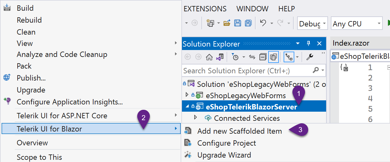
Start the scaffolding tool by right clicking on the eShopTelerikBlazorServer project and choosing Telerik UI for Blazor from the menu, then click Add new Scaffolded Item.
- Select the Grid component (if not already selected) in the Blazor Scaffolding Wizard dialog.
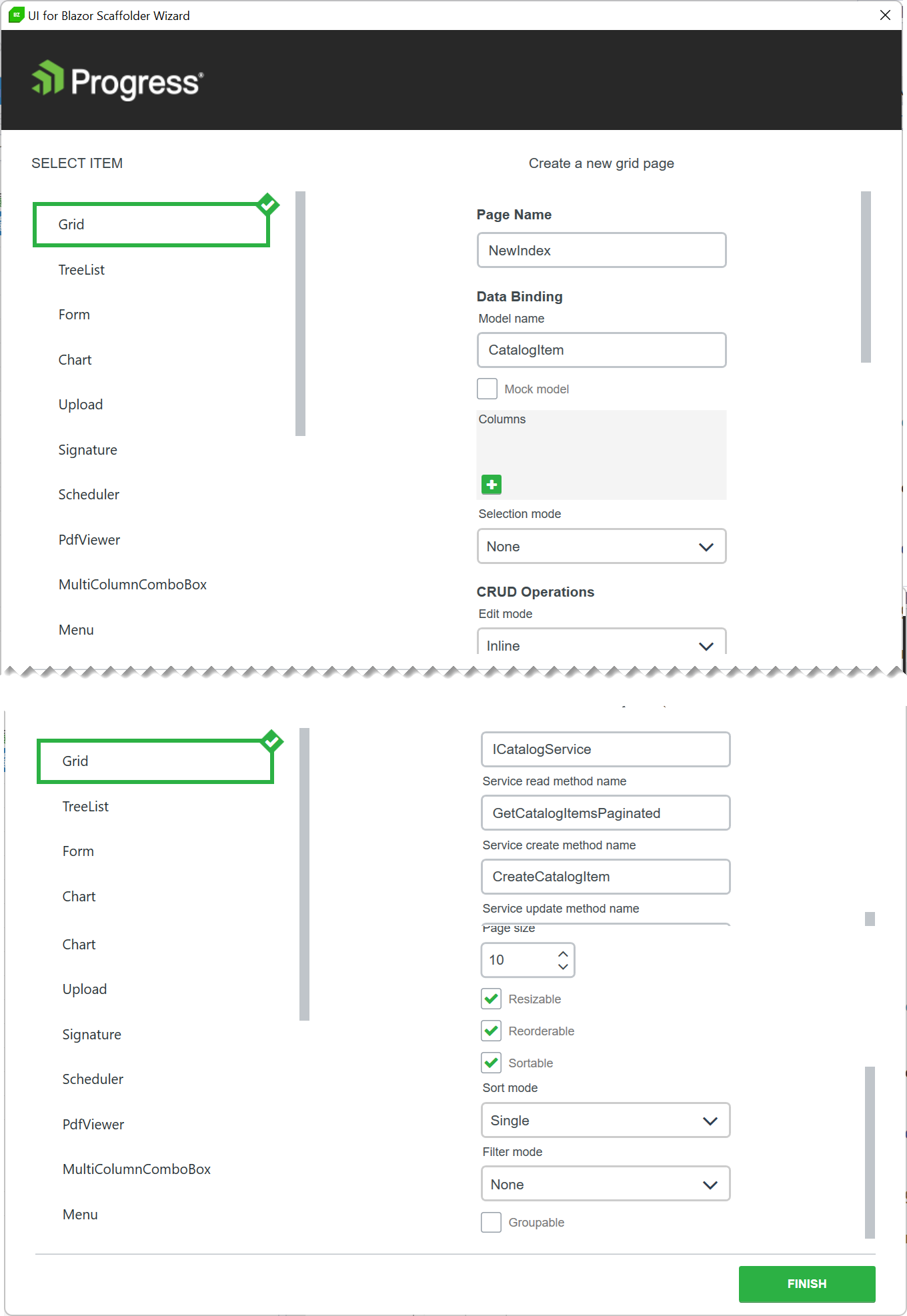
- Apply the following settings to the Grid
- Page name: New Index
- Model name: CatalogItem
- (uncheck) Mock model
- Edit mode: Popup
- Service name: ICatalogService
- Service read method name : GetCatalogItemsPaginated
- Service create method name: CreateCatalogItem
- Service update method name: UpdateCatalogItem
- Service delete method name: RemoveCatalogItem
- (check) Pageable
- (check) Resizable
- (check) Reorderable
- (check) Sortable
- Filter mode: Filter Menu
- Click Finish
- Update the page route directive from “/NewIndex” to “/”.
@page "/"- Bring dependencies into scope by adding the following using statements to
_Imports.razor.
@using Telerik.FontIcons @using eShopLegacyWebForms.Models @using eShopLegacyWebForms.Services- The scaffolding tool defaults to async methods. Replace
async Taskwithvoidfor the LoadData, Create, Update, and Delete methods. Remove theawaitkeyword from all LoadData statements.
Modern .NET applications make heavy use of async/await. By default the scaffolding tool creates async methods. To further modernize the codebase async/await is recomended for services, however migrating services is beyond the scope of the workshop.
- Update the service call in LoadData. Use the GetCatalogItemsPaginated method to get the first 10 items from the first page of data in the database. The method returns a view model with a Data property that contains the resulting CategoryItems. Apply the results to the page’s Data property.
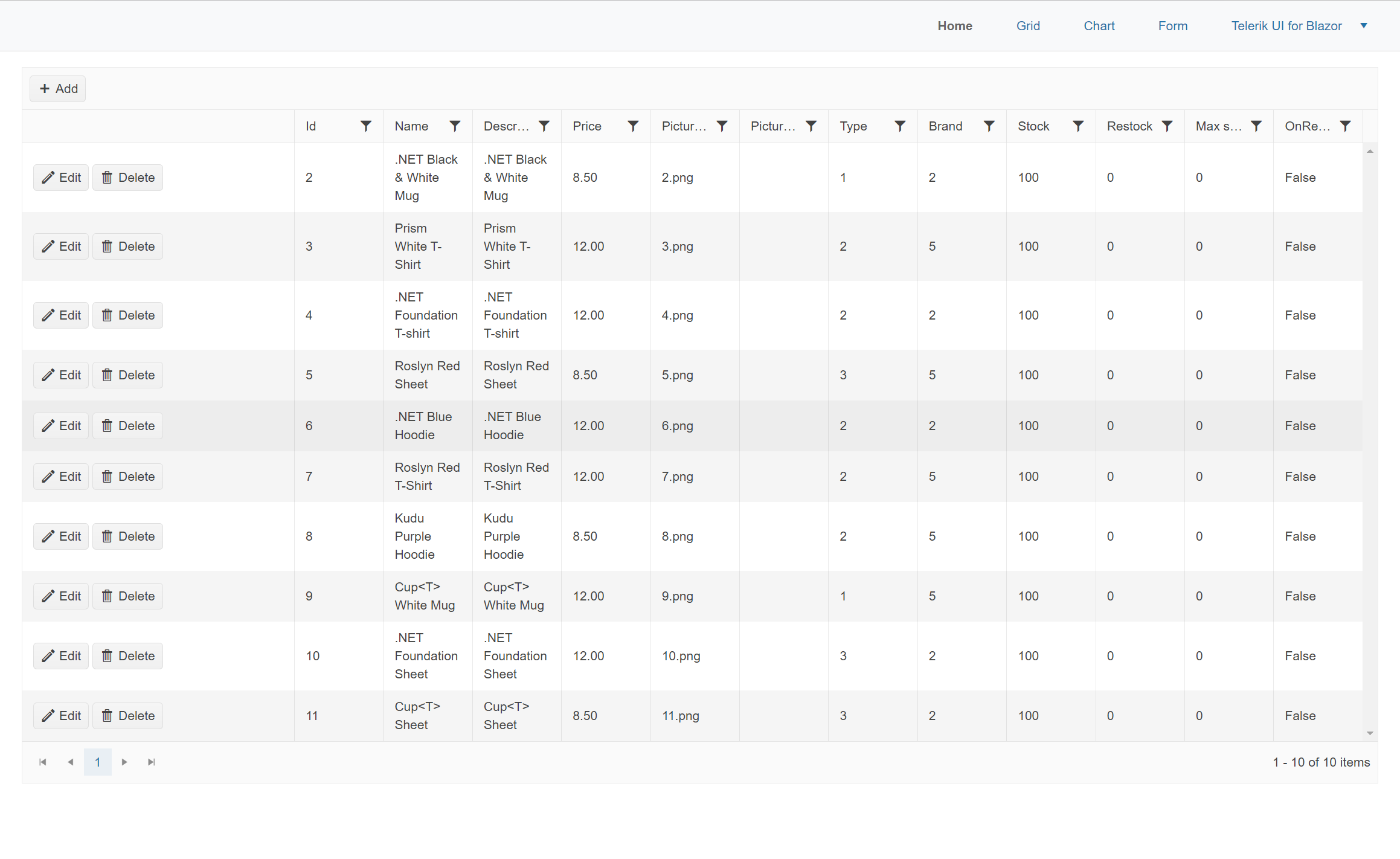
Data = DataService.GetCatalogItemsPaginated(10,0).Data.ToList();- The Telerik Data Grid’s auto-generated columns feature allows the grid to generate columns based on meta data. The CategoryItem’s properties and annotations affect what columns show and how they’re formatted. Run the application to see the auto-generated grid.
Depending on the scenario, generated columns can be enough to complete the task. Alternatively, columns can be defined in markup for complete customization with templates. This workshop demonstrates both approaches.
-
-
To enhance the performance of the application and reduce development time, the Telerik Grid can work directly with Entity Framework (EF). Through the Telerik DataSourceRequest object, the grid will supply EF with state information such as: sort, filter, and page selections. This state data is presented to EF as an expression that it can create SQL queries from. Enable query based paging, sorting, and filtering using the Telerik DataSourceRequest.
- Modify the CatalogService and CatalogServiceMock to implement the Telerik DataSourceRequest object. Replace the GetCatalogItemsPaginated method. The method should return a Telerik DataSourceResult and take a DataSourceRequest as a parameter. Replace the existing OrderBy, Skip, and Take LINQ methods with the ToDataSourceResultAsync extension method. The ToDataSourceResultAsync method takes the request argument and applies the grid’s meta data to the query.
public Task<DataSourceResult> GetCatalogItemsPaginated(DataSourceRequest request) { return db.CatalogItems .Include(c => c.CatalogBrand) .Include(c => c.CatalogType) .ToDataSourceResultAsync(request); }- For the CatalogServiceMock use the AsQueryable method to cast the mocked items as Queryable before applying the ToDataSourceResultAsync extension method.
public Task<DataSourceResult> GetCatalogItemsPaginated(DataSourceRequest request) { var items = ComposeCatalogItems(catalogItems); return items.AsQueryable().ToDataSourceResultAsync(request); }- Update the ICatalogService interface with the new method signature.
Task<DataSourceResult> GetCatalogItemsPaginated(DataSourceRequest request);- In NewIndex.razor, make use of Telerik Grid’s OnRead event. The OnRead event’s GridReadEventArgs argument contains the DataSourceRequest needed by GetCatalogItemsPaginated. Update the LoadData event to an async Task, then add a parameter for the GridReadEventArgs.
async Task LoadData(GridReadEventArgs args) { DataSourceResult results = await DataService.GetCatalogItemsPaginated(args.Request); args.Data = results.Data; // apply Data args.Total = results.Total; // update Totals }- Update the TelerikGrid component, add a delegate for the OnRead event that uses the LoadData method.
<TelerikGrid Data="@Data" ... OnRead="@LoadData">- The Telerik Grid will no internally trigger the OnRead event as needed. It is no longer necessary to manually call LoadData. Remove all calls to LoadData.
// Remove all LoadData();- Run the application, try sorting, filtering and paging the data. Note that all actions are directly translated to SQL queries that only fetch the necessary data from the database, reducing server overhead.
-
The Telerik Grid can easily be customized with a wide variety of templates. Add a GridColumn template to show an image from the CatalogItem. The Template can contain any HTML element, Razor code, and other components.
-
Add a GridColumn to the GridColumns element.
- Set the GridColumn with the following properties:
- Field=”@nameof(CatalogItem.PictureFileName)”
- Title=”Picture”
- Width=”130px”
- Filterable=”false”
- Editable=”false”
<GridColumns> <GridColumn Field="@nameof(CatalogItem.PictureFileName)" Title="Picture" Width="130px" Filterable="false" Editable="false"> </GridColumn> ... <GridColumns>- Inside the GridColumn, add a Template with a razor code block
@{}inside. Within the code block write a razor snippet that displays the PictureFileName in an HTML img element.
<GridColumn Field="@nameof(CatalogItem.PictureFileName)" Title="Picture" Width="130px" Filterable="false" Editable="false"> <Template> @{ var item = (CatalogItem)context; <img src="@($"/Pics/{item.PictureFileName}")" style="max-width:100px;" alt="Image of @item.Name" /> } </Template> </GridColumn>- Run the application and examine the template column.

Note: AutogeneratedColumns and custom columns can be mixed within the grid using the
tag. However, in the next exercise the AutogeneratedColumns feature will be disabled to further explore column customization with the Telerik Grid. -
-
Disable the AutoGenerateColumns columns feature. Then add columns for the remianing properties of the CatalogItem class.
<TelerikGrid ... AutoGenerateColumns="false" .../>Note: Field names are easily set and maintained using the
nameofoperator. However, some values require a string literal to produce the proper navigation to deeply nested property names. Example: The field CatalogItem.CatalogBrand.Brand, can’t be expressed withnameof, and must be represented as the stringCatalogBrand.Brand.<GridColumns> ... <GridColumn Field="@nameof(CatalogItem.Name)" /> <GridColumn Field="@nameof(CatalogItem.Description)" /> <GridColumn Field="CatalogBrand.Brand" Title="Brand"/> <GridColumn Field="CatalogType.Type" Title="Type" /> <GridColumn Field="@nameof(CatalogItem.Price)" /> <GridColumn Field="@nameof(CatalogItem.PictureFileName)" Title="Picture Name" /> <GridColumn Field="@nameof(CatalogItem.AvailableStock)" Title="Stock" /> <GridColumn Field="@nameof(CatalogItem.RestockThreshold)" Title="Restock" /> <GridColumn Field="@nameof(CatalogItem.MaxStockThreshold)" Title="Max Stock" /> </GridColumns> -
Use the GridColumn’s DisplayFormat property to display the column’s values in a currency format.
<GridColumn Field="@nameof(CatalogItem.Price)" DisplayFormat="{0:C}" /> -
Set the FilterMenuType to FilterMenuType.CheckBoxList for the Brand and Type columns.
The Telerik Grid has menu options that offer a better UX for certain data sets. The CheckBoxList menu aggregates data inside a simple checkbox list menu. Try toggling the menu types to see the difference.
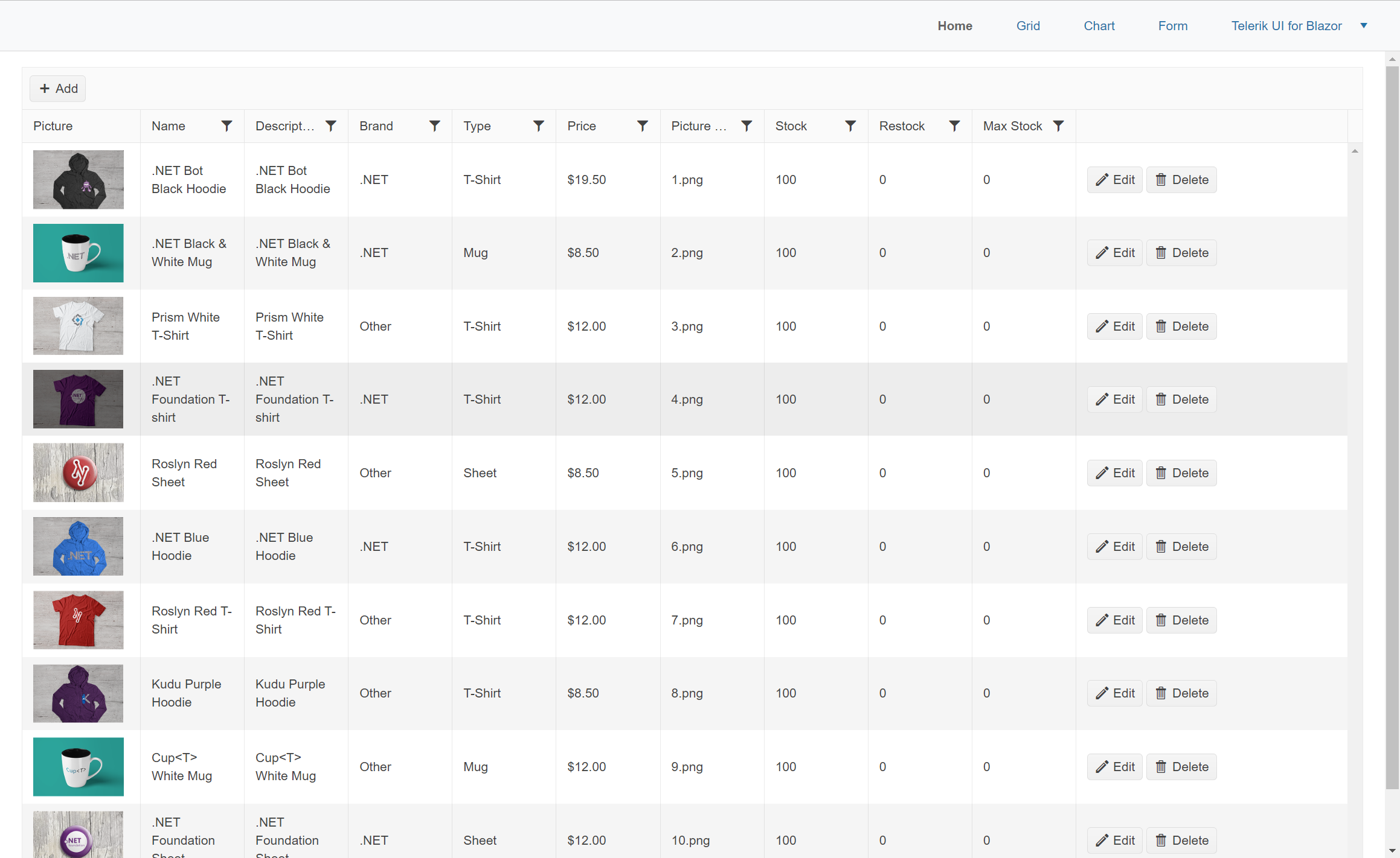
<GridColumn Field="CatalogBrand.Brand" Title="Brand" FilterMenuType="@FilterMenuType.CheckBoxList"/><GridColumn Field="CatalogType.Type" Title="Type" FilterMenuType="@FilterMenuType.CheckBoxList"/>- Run the application and view the customized grid, try filtering different columns.
Conclusion
In this section we used Telerik UI for Blazor to generate a grid view. In addition, we learned how to leverage the grid’s meta data to enhance application performance using the DatasourceRequest API. We used the grid’s formatting and template features, and enhanced the filtering capabilities. The Telerik Grid offered a complete replacement for the legacy view while adding features and improving performance.
In the next section we will complete the migration by replacing the remaining legacy views.